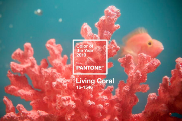
As a SCUBA diver, I was excited to learn that Pantone had recognized and selected a color from one of our Earth\’s most beautiful, vibrant, but fragile natural resources. Thousands of years old, our coral reefs are an vital part of our ecosystem, providing nurturing sustenance and beauty to living creatures above and below the waterline. Now with Pantone\’s recognition, non-divers can delight in this fresh and nurturing, \”living\” color!
For the past 19 years, Pantone’s secret lyceum of color experts explore the world to select one color that personifies the trending zeitgeist or fusion of modern life and culture influencers. This year’s search explores the ocean and our delicate coral reefs, naming “Living Coral”, as the 2019 Pantone Color of the Year. This upbeat sort of peachy, pinky Instagram sunset-shade of orange, with a golden undertone appears in our natural surroundings and is appearing more and more in social media.
Leatrice Eiseman, executive director of the Pantone Color Institute emphasizes the \”Living\” in the color name. Not only does this name designate one coral among several in PMS’ gigantic color naming system, “the Color of the Year (COTY) choice draws on symbolic meanings and is connected to the world at large, social issues, the pressing stuff in this day and age,” Eiseman explains. “Whenever coral appears under the sea, they feed and nourish fish. It’s imperative that we preserve our coral reefs as part of the ecosystem.”
Amid the challenging atmosphere of world politics and corruption in the technology sector, people are turning to color to lift their moods. The pervasiveness of cheerful hues color our hearts and minds toward optimism and positive human connections.
Unlike last year’s mystical UltraViolet, Living Coral embodies playfulness, energy, and a yearning to reconnect with nature. Keep your eye out for this peachy shade appearing on fashion runways – naturally suited across all ages and genders; cosmetics – bringing natural color in blush, eyes, and lips; furniture and home interiors – creating a warm, comforting, and nurturing feeling even as a color pop; and of course digital/social media – evoking the organic and inspirational feeling of our natural surroundings.
Pantone’s choice is also a reminder that some of the best colors come from nature. By drawing attention to the unique and exquisite beauty of coral reefs, Pantone is also issuing a subtle reminder not to forget their fragility and the importance of their preservation. How will Living Coral influence your life?


